FAIRE INTERNSHIP
Reducing retailer membership churn
%20(2)%20(1).gif)
Context
Faire is a two-sided wholesale marketplace that connects independent retailers with local brands.
Faire's mission is to empower retailers to strengthen the unique character of local communities and businesses.
Time
1 month
Team
Designer (Me)
Software Engineer
Data Scientist
Product Manager
Software Engineer
Data Scientist
Product Manager
Constraint
No UX Research
No Testing
No Testing
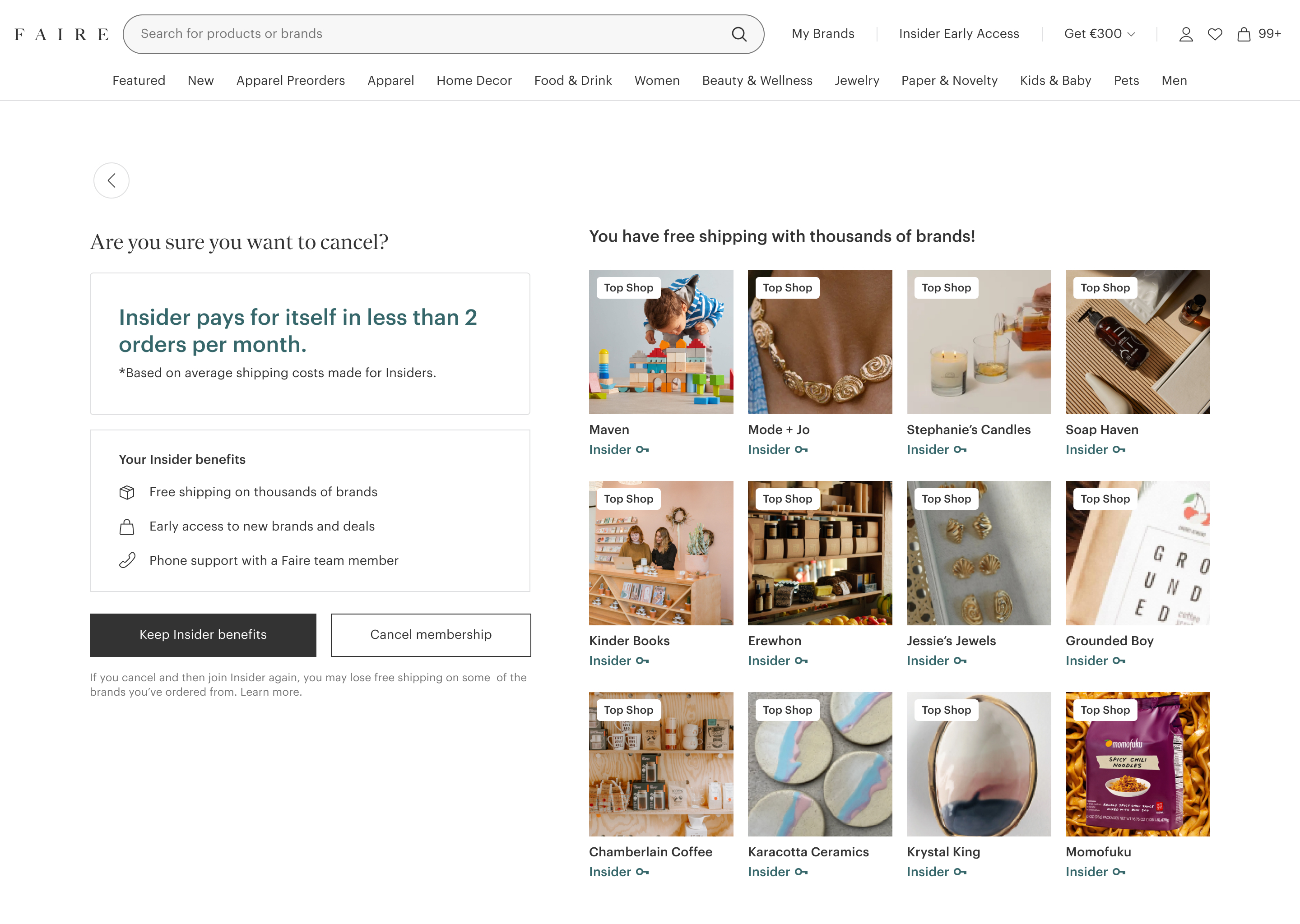
Insider is a membership program where retailers get free shipping.
Retailers pay a monthly fee of $19.99 to stay subscribed to the program and gain these benefits. Faire provides free shipping coverage for brands based on shipping distance and also popularity in their category.
🛍️ Free shipping with 100+ brands
💵 No Import Duties
📞 Customer Phone Support
.png)
Problem
Annual Insider members decreased by 10% in 2024.
From user research, retailers are cancelling their membership because they don't understand the value and benefits of Insider.
.png)
My Impact
I re-designed the cancellation flow, decreasing monthly churn rates by 8%.
I worked with product managers, data scientists, and customer success teams.
V1 shipped to 10,000 retailers
Research
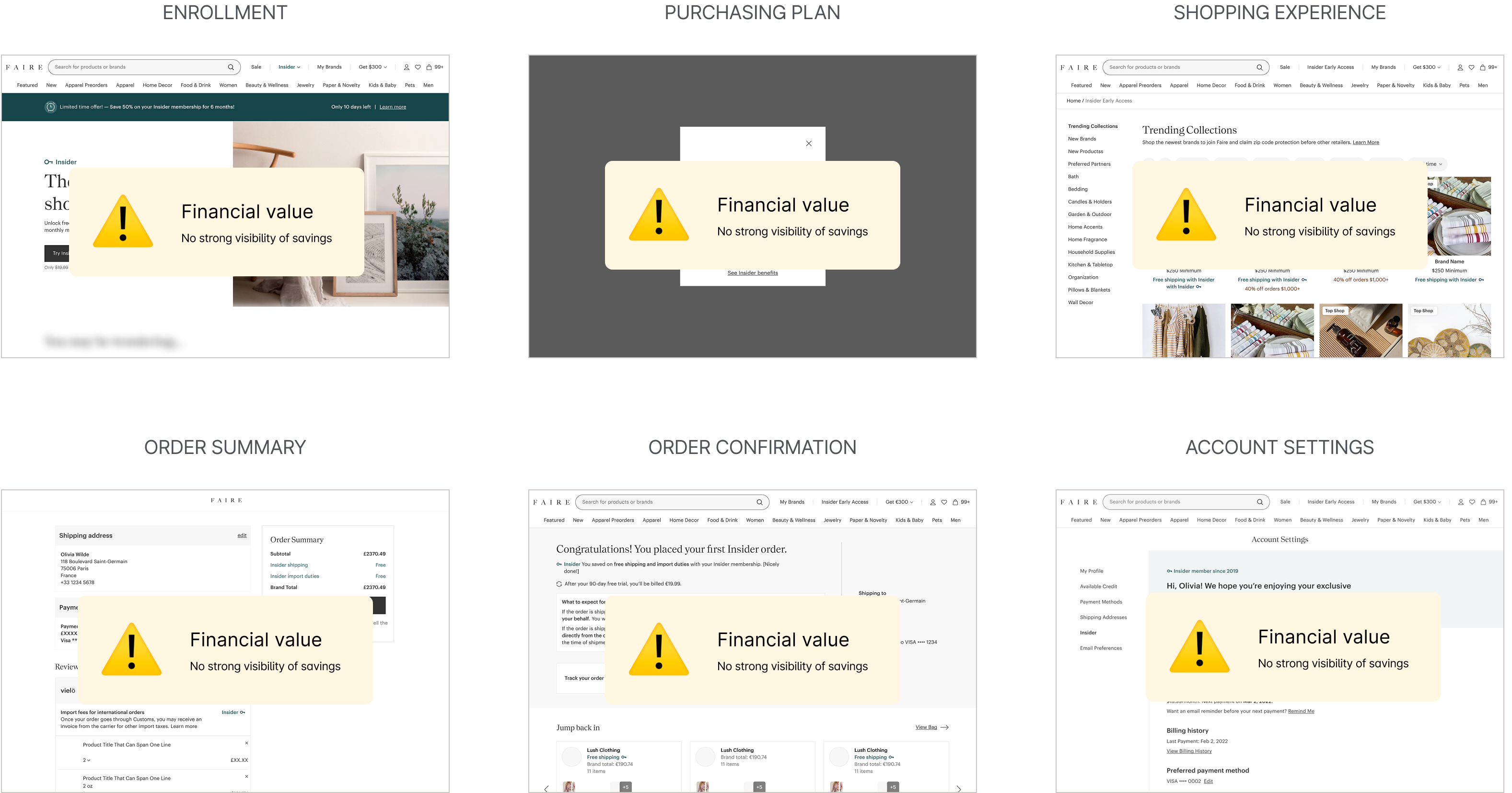
From competitive research, I analyzed how memberships show value.
I used these value principles to guide my audit of the Faire membership program and understand customer sentiment.
I saw there was a lack of visibility in savings shown throughout the retailer's membership experience.
Since Insider free shipping is the core value proposition, retailers were cancelling because Insider was not financially worth it for their business.
Hypothesis
If retailers understand the value of their free shipping benefits, they'll be less likely to churn from Insider.
The current cancellation funnel has a 98% cancellation rate
I saw that there was large room for improvement in UX copy, content and visual design

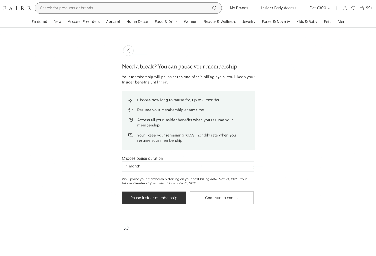
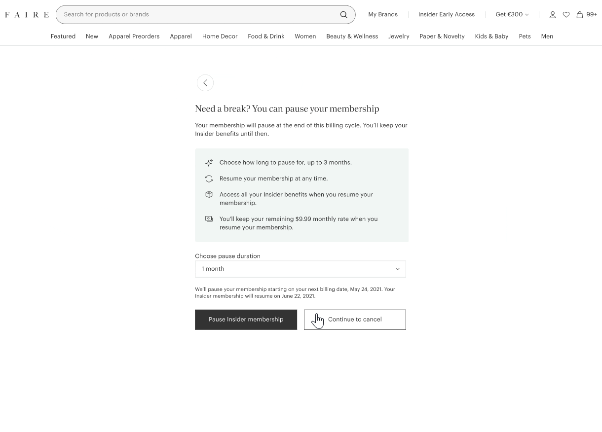
Pause

Benefits screen

.Cancellation form
Challenge #1: Optimizing the flow
What should we include in the cancellation flow?
Retailers often have strong reasons for canceling, so it's crucial to add value without creating unnecessary friction. We discussed adding a discount recovery offer to the cancellation flow to address the lack of financial benefits.
Benefits
Form
Pause
Recovery Offer (NEW)
Determining the order of the cancellation flow
The pause option initially appears too early in the cancellation process, making it feel abrupt. By moving it after the benefits screen, retailers are more informed about the membership and likely to consider pausing.
ORIGINAL
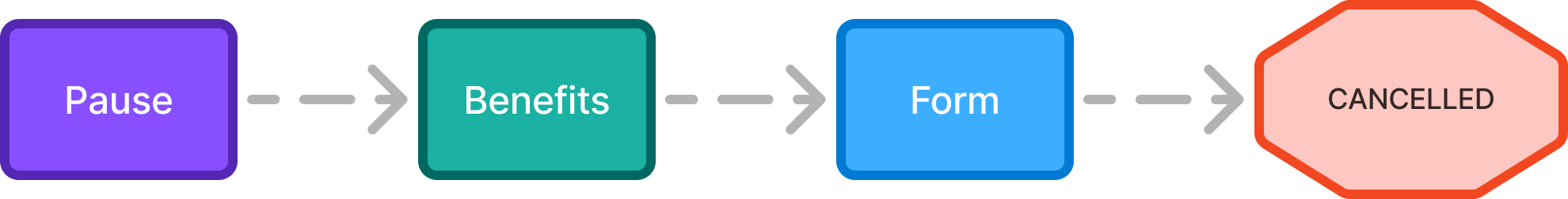
- No strong reason for why retailers should pause.
CHOSEN
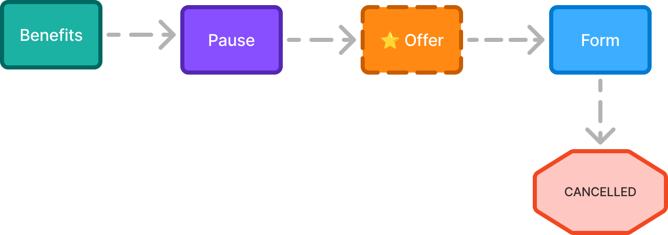
- Optimizes for membership retention of keeping their membership
- Retailers more willing to pause as a last resort
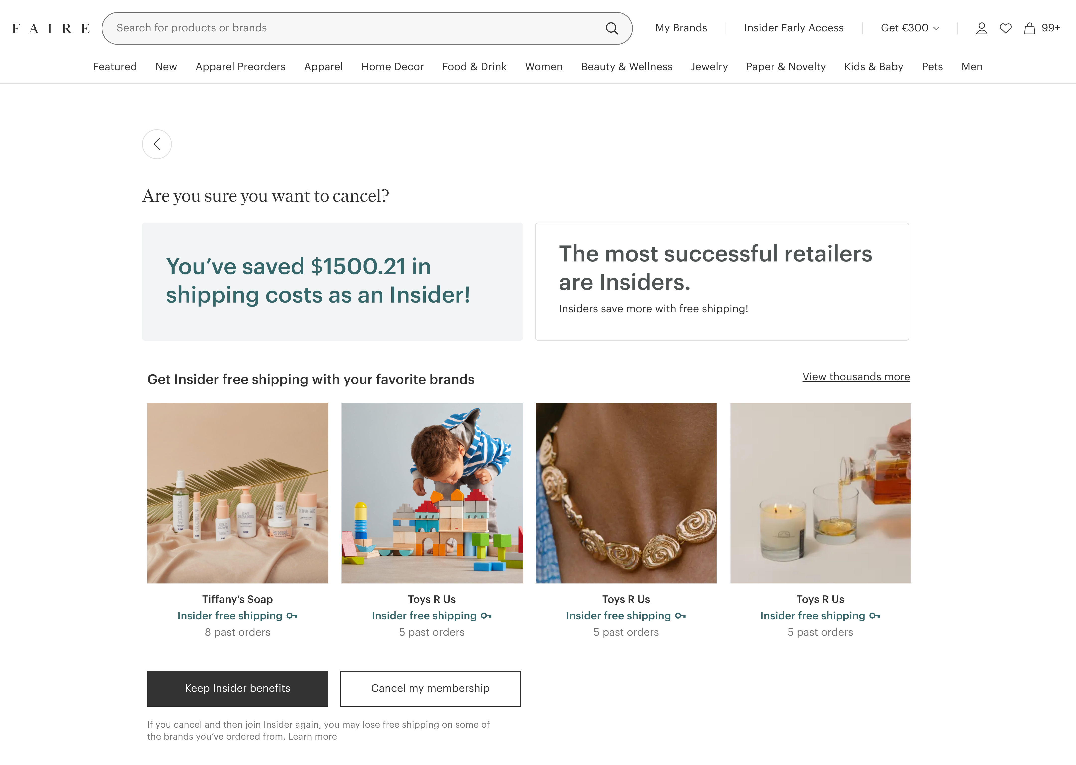
Presenting the retention offer
Next, I explored how the retention offer should be presented. I decided to add the recovery offer as a second step so that it feels more trustworthy for users to accept.
VERSION #1
Pop-up modal
- Spammy and intrusive
- Inclined to dismiss
CHOSEN
Separate page
- More trustworthy
- Adds extra screen in flow
Challenge #2: Designing the Benefits Screen
I chose to start designing for Breaking Even retailers because Faire had the most data points and potential to win them back as customers.
The data scientist team discovered a near 50/50 split of two retailer groups cancelling.
"I don't understand that I'm saving with my brands."

Sweet Candles
Breaking Even
"I'm not saving since I'm not ordering enough."

Joe's Ties
Not Breaking Even
Since this group has ordered a lot, my design strategy is reminding them about their free shipping brands.
Across all brand categories, I believed retailers cared the most about their most re-ordered brands because they've gotten free shipping value with them.
I hypothesized that breaking even retailers want to stay with Insider for their key brands.
Initial design explorations
I explored three differenet designs using key brands to contextualize the value of their Insider membership.
VERSION #1
Breaking down savings across key brands
- Statistics don't convey value.
- Unclear messaging.

VERSION #2
Social proof of Insider value
- Text-based savings are more relatable.
- Multiple messages dilute the primary message
CHOSEN
Loss aversion of Insider benefits
- More motivated to avoid losing benefits.
- Coherent sticky message.
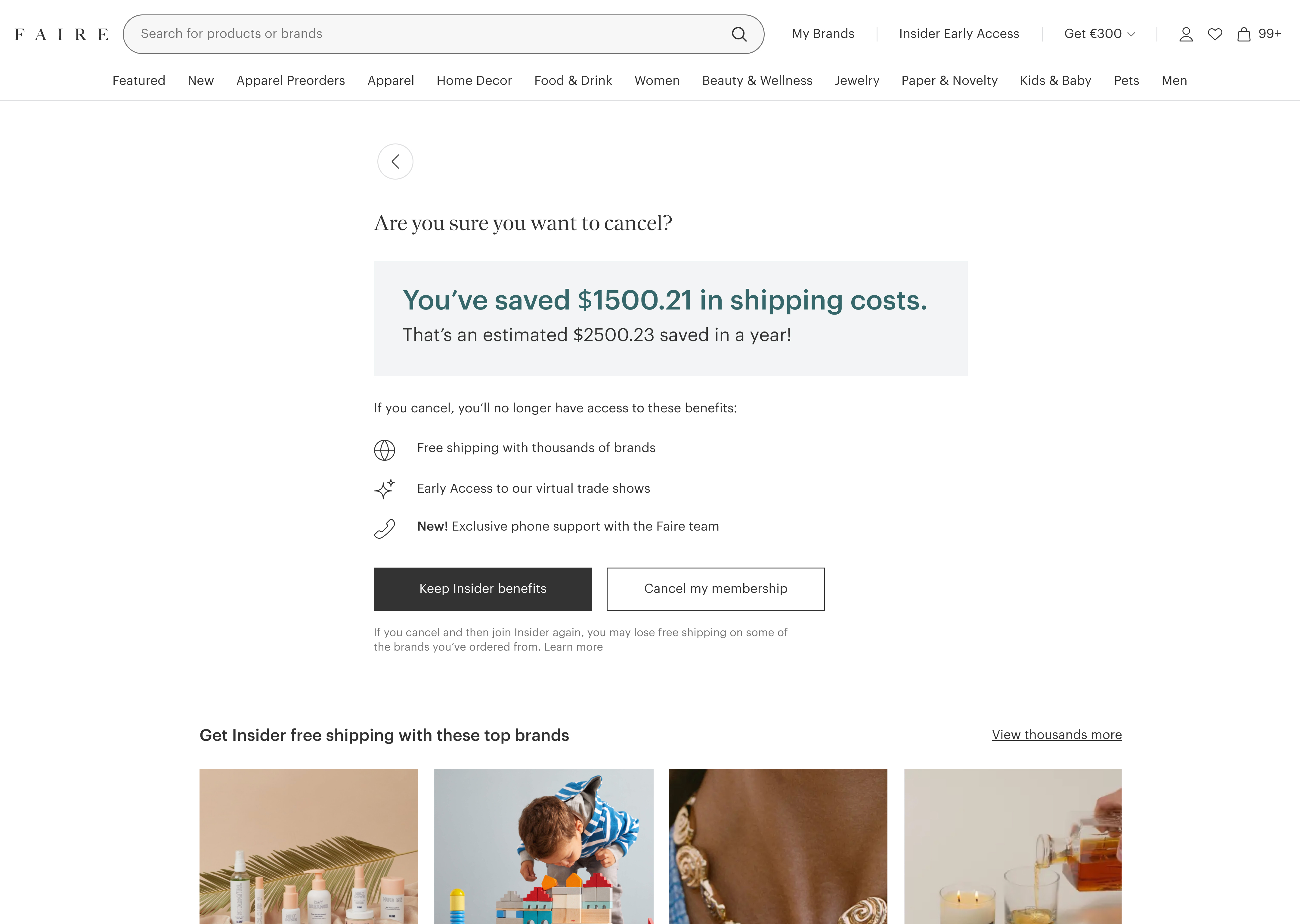
Midway feedback
I shared my designs explorations with the customer success team and discovered a core insight.
INSIGHT #1
Key brands don't matter to churning retailers.
It's extremely hard to predict what brands retailers want to continue getting free shipping with.
Back to the drawing board!
I pivoted from highlighting key brands to a large quantity of brands.
I decided to help retailers visualize the quantity of free shipping access they have in their membership.
BEFORE
Key Brands
AFTER
Large Quantity of Brands

Content Design
I explored different layouts to display all the brands.
VERSION 1
Brands below the fold
.png)
VERSION 2
Brands in a carousel
.jpg)
CHOSEN
Brands side by side
- See entire membership in one view.
- Allows making informed decision.

I explored how to label all these brands.
This is not a discovery point. Retailers aren't shopping here, so I chose to emphasize access to top brands with free shipping.
VERSION 1
Contextualizing brands
.png)
CHOSEN
Tagging as "Top Shop"
.png)
Final Touches
With the main design decisions made, we refined the nitty gritty details for both retailer segments.
Segment #1: Breaking Even Retailers.
Added the definition of what total savings means.
Visually call-out the savings metric.
.jpg)
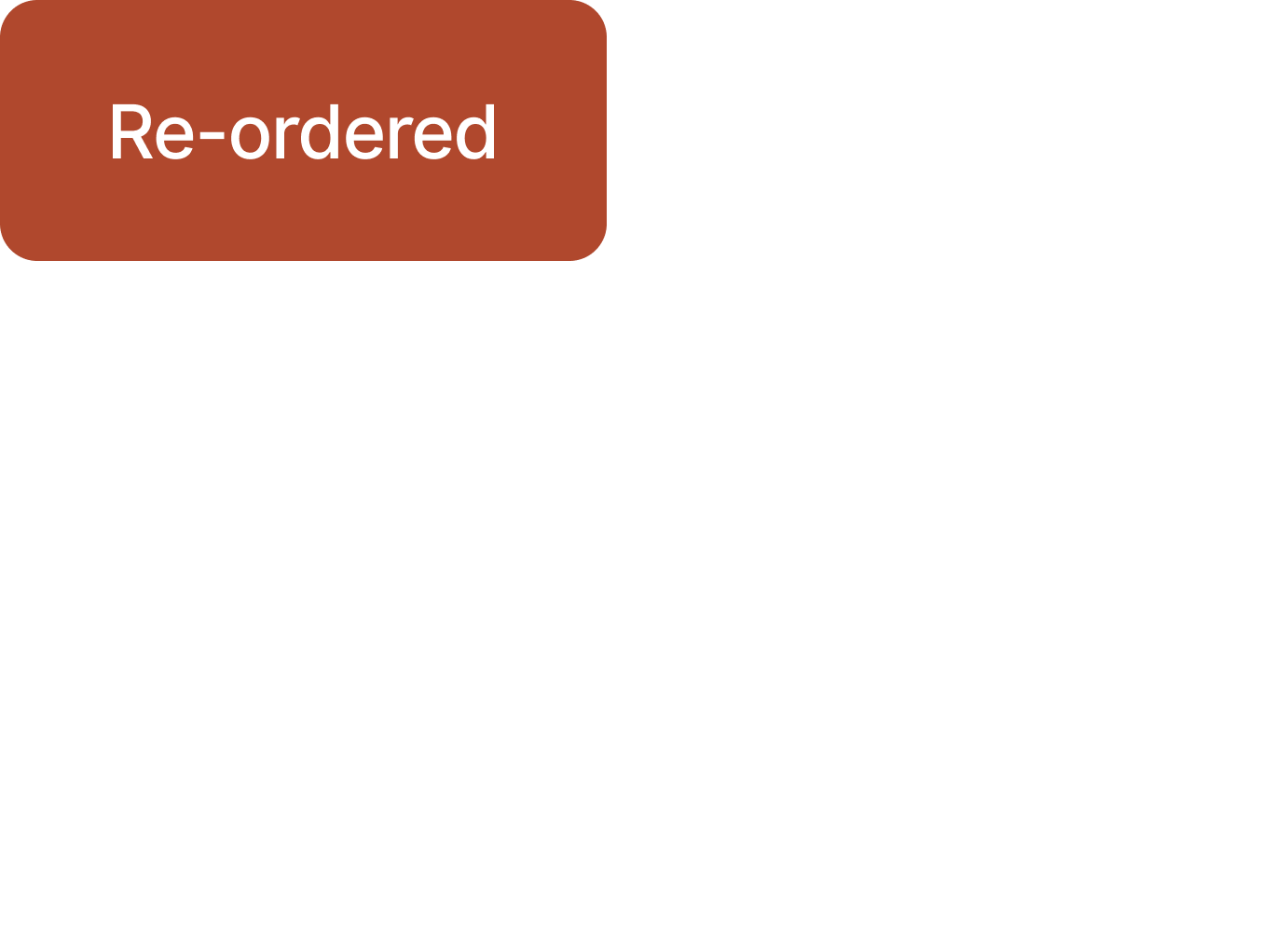
Segment #2: Not Breaking Even Retailers.
VERSION 1
Projected annual savings
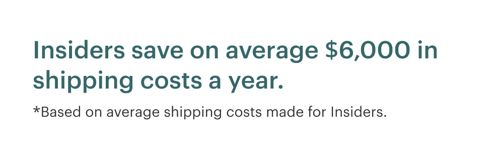
CHOSEN
Showing how easy it is to break-even
Final Designs
MISSION SUCCESS
We shipped Phase 1 of this flow to 10,000+ retailers!
.png)
Grateful for the journey! Here's what I learned....
Data doesn’t tell the entire story
We had more data than we could work with. But without qualitative research, we wouldn’t have understood the full picture of the problem.
Know what type of feedback to ask for
I worked with PM and engineers of all shapes; Some didn’t want to get into the nitty gritty details of design. I also worked with senior staff designers who knew almost nothing about the project. So knowing what feedback to ask for is valuable in getting useful and good feedback.